Brand Identity
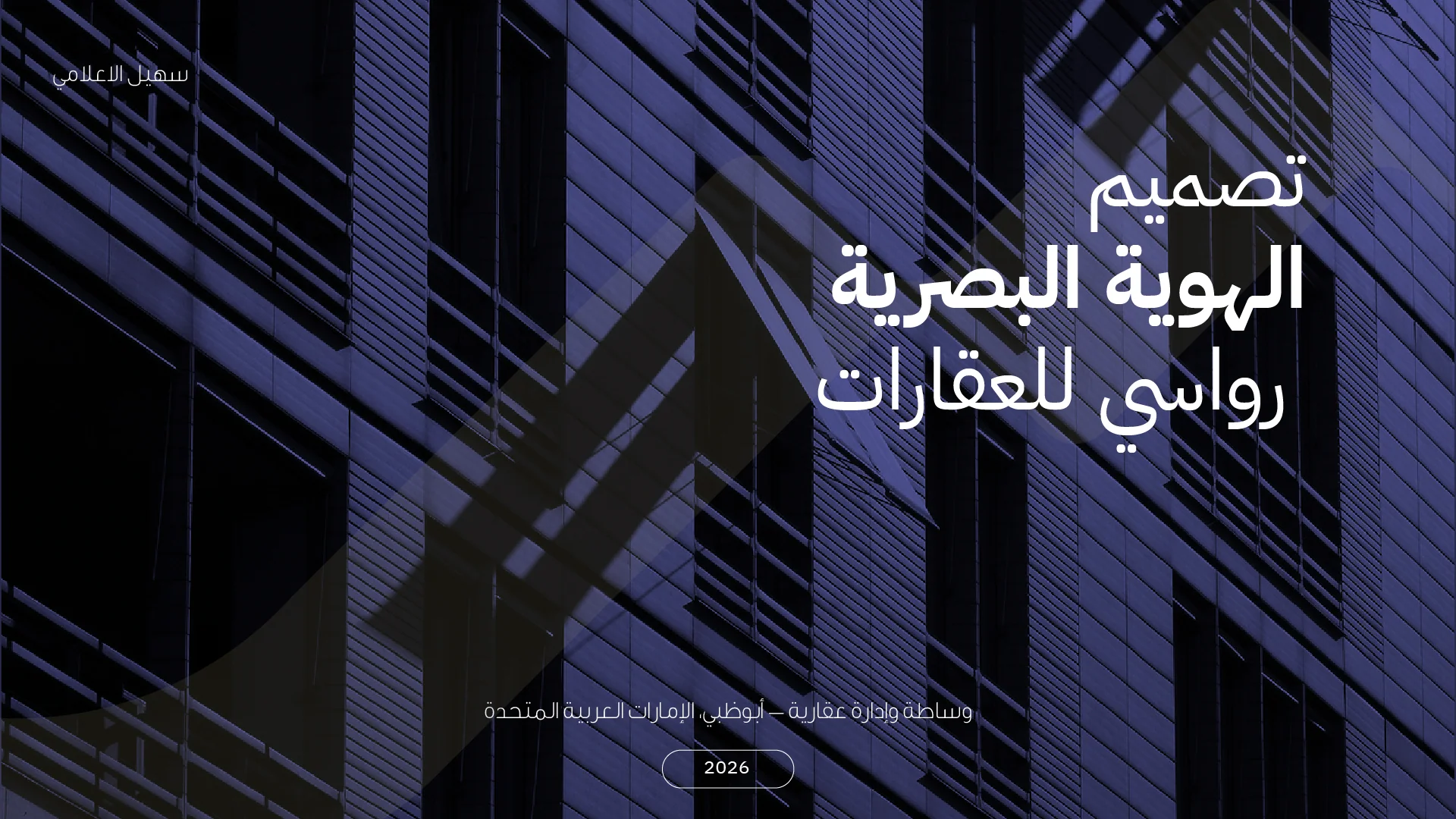
RAWASY Real Estate
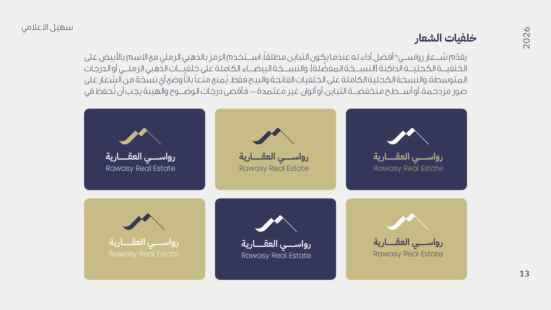
A complete Arabic brand identity for an Abu Dhabi real-estate brokerage — a name that means "anchored mountains," paired with a muted sand-gold and deep corporate navy system built on trust.
The Challenge
RAWASY is a real-estate brokerage and management company in Abu Dhabi. The identity had to say one thing from the very first glance: "this is a company you can trust" — to families looking for a home, local and Gulf investors, and companies searching for headquarters.
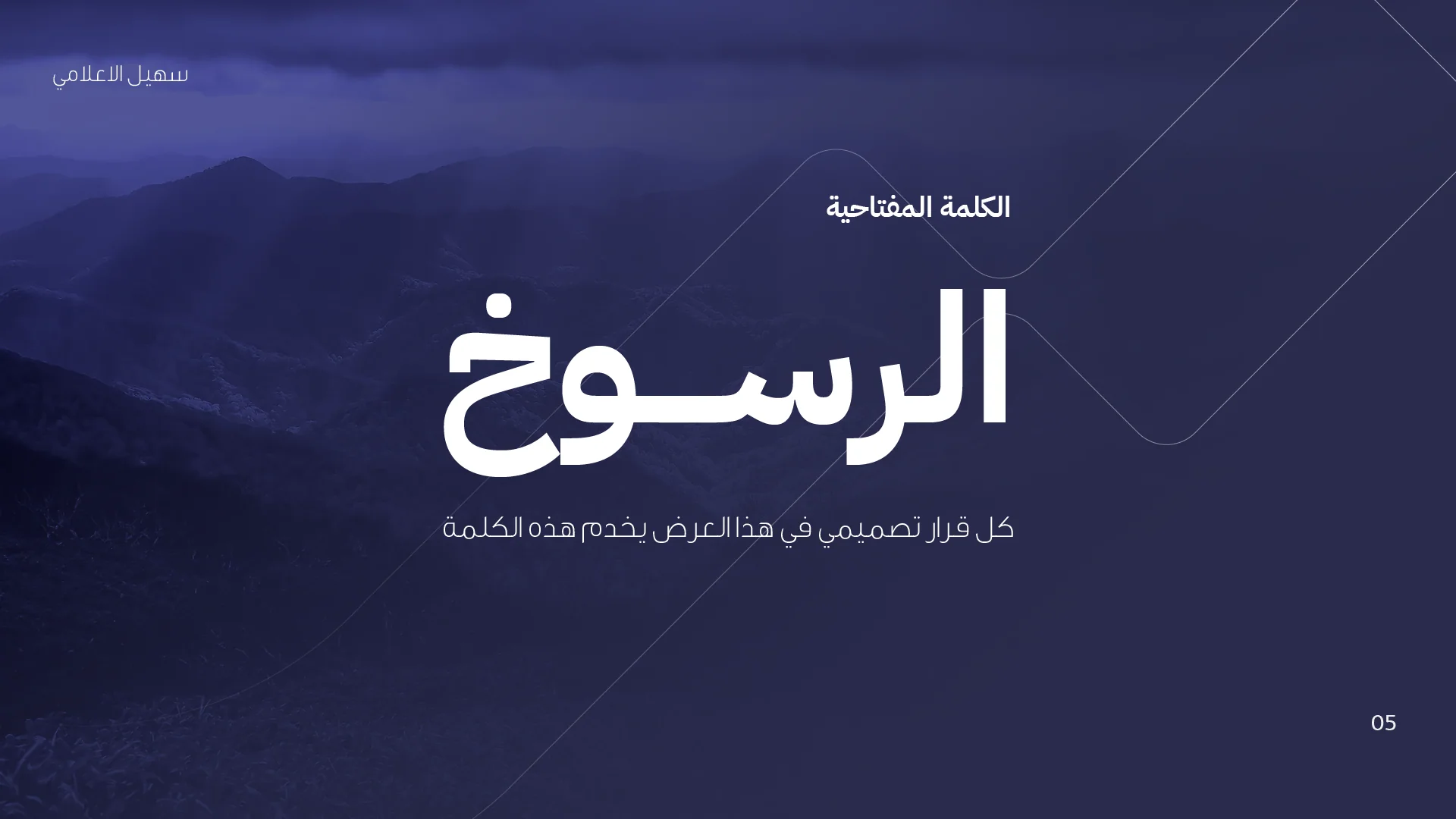
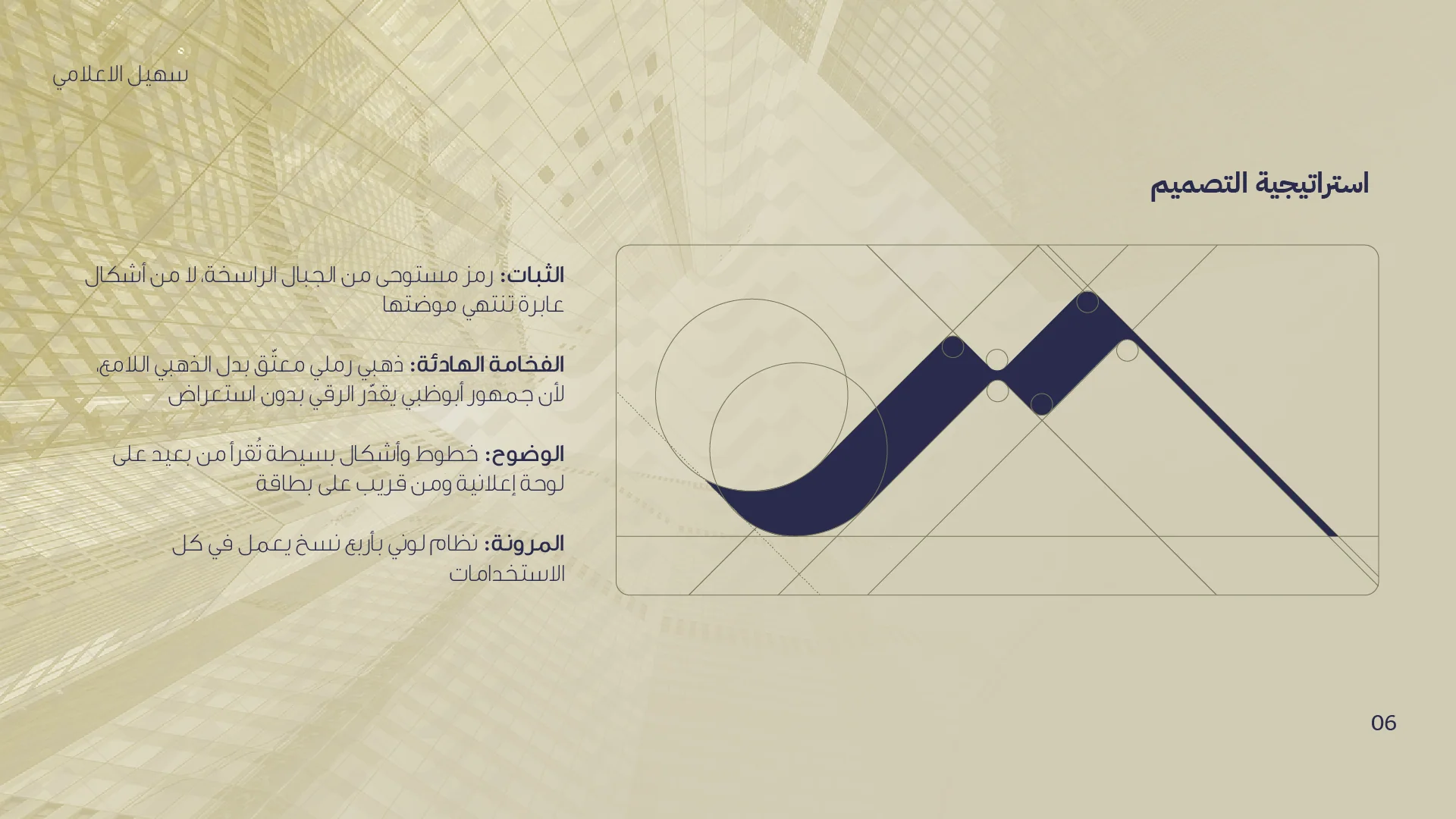
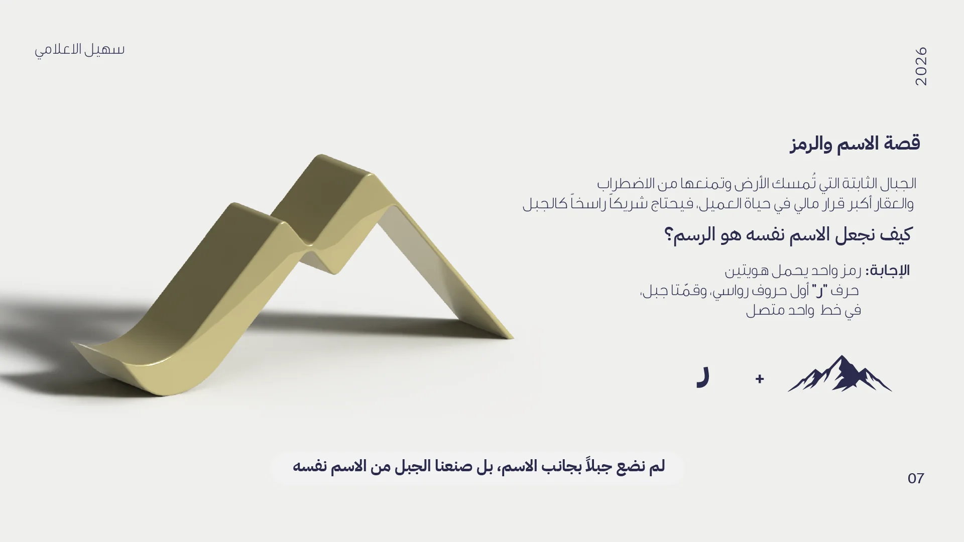
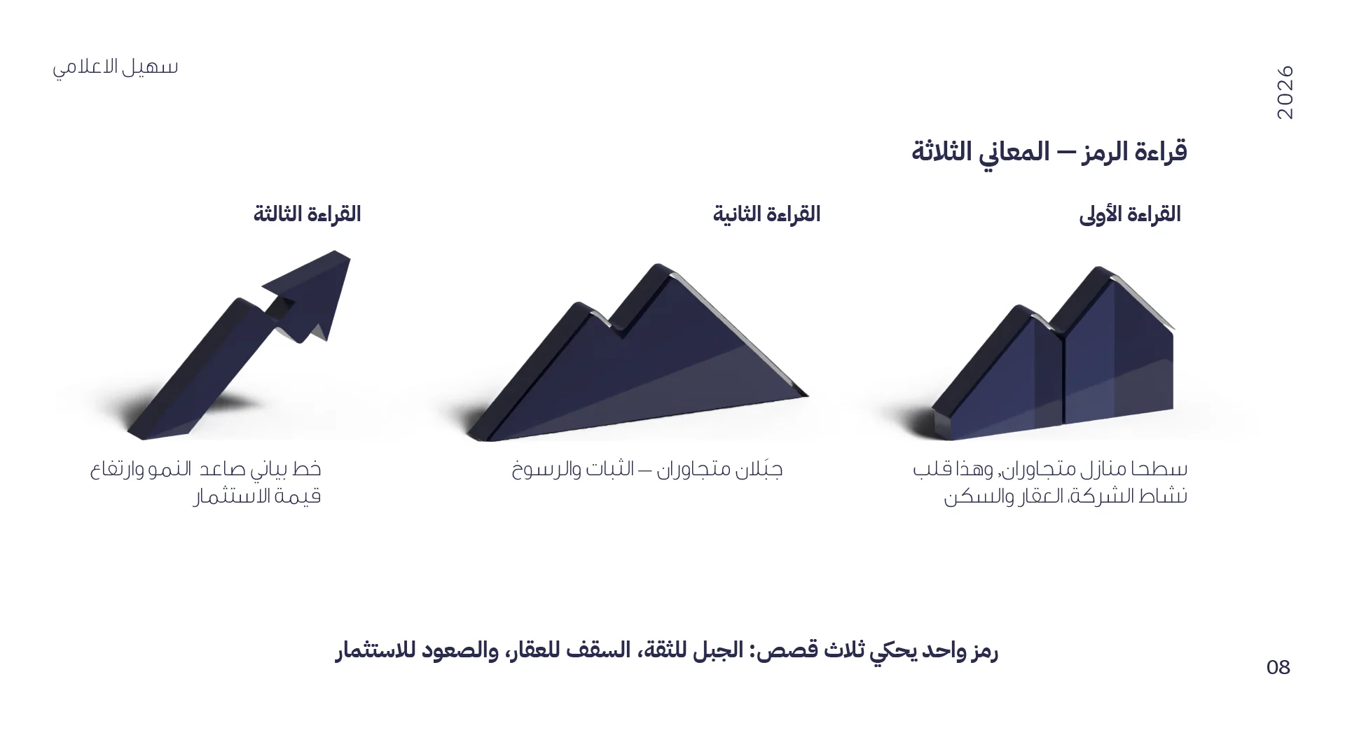
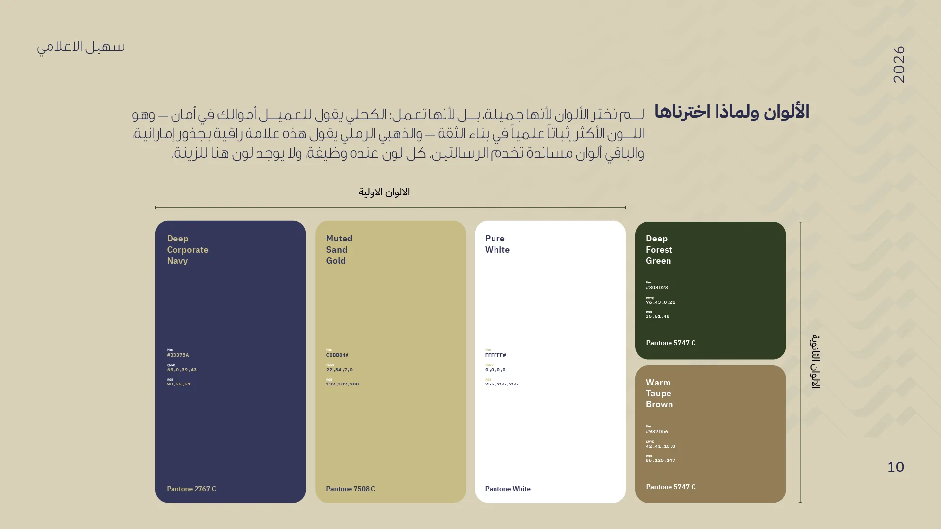
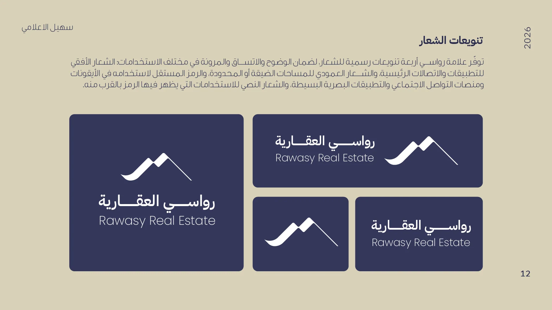
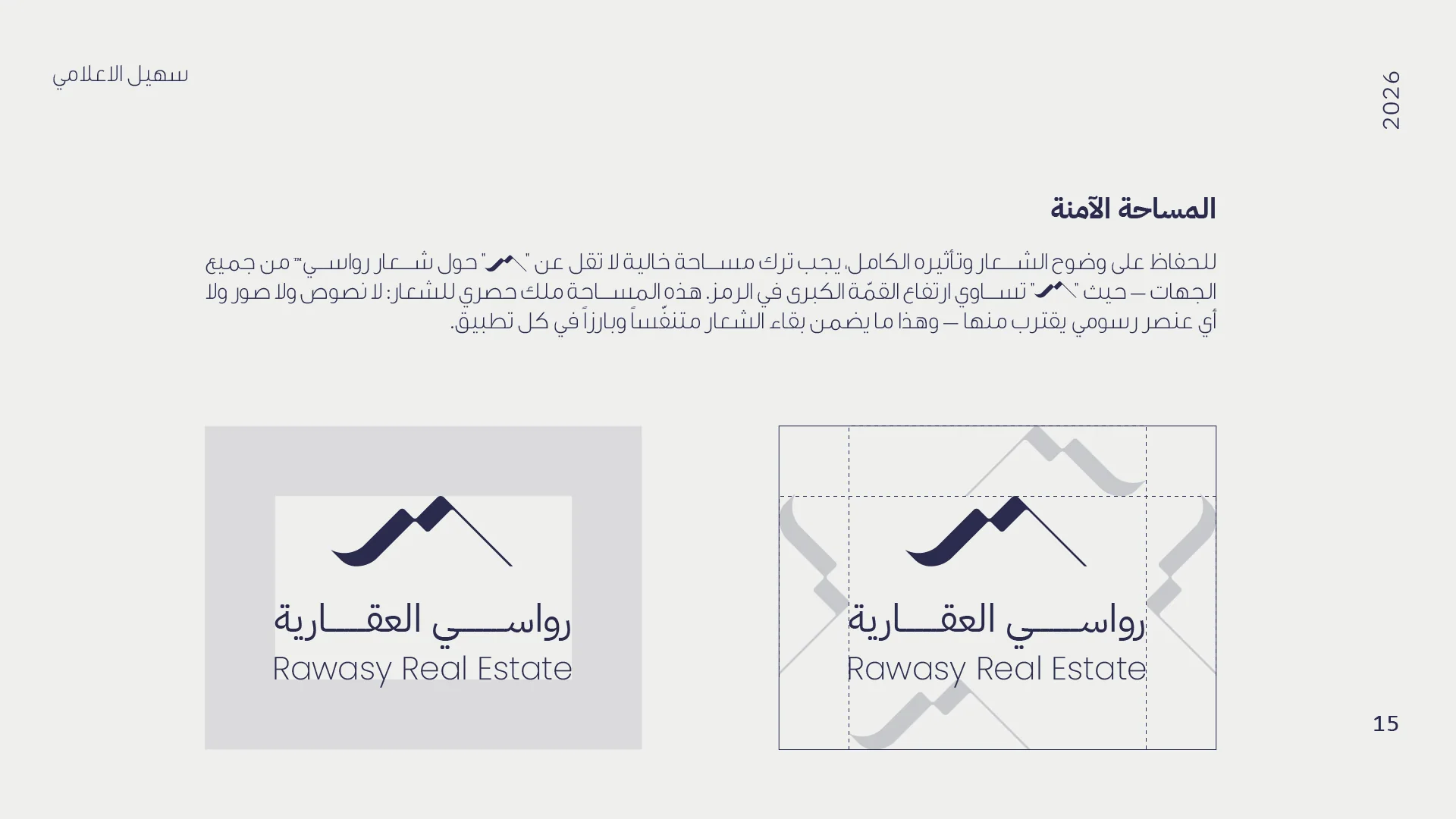
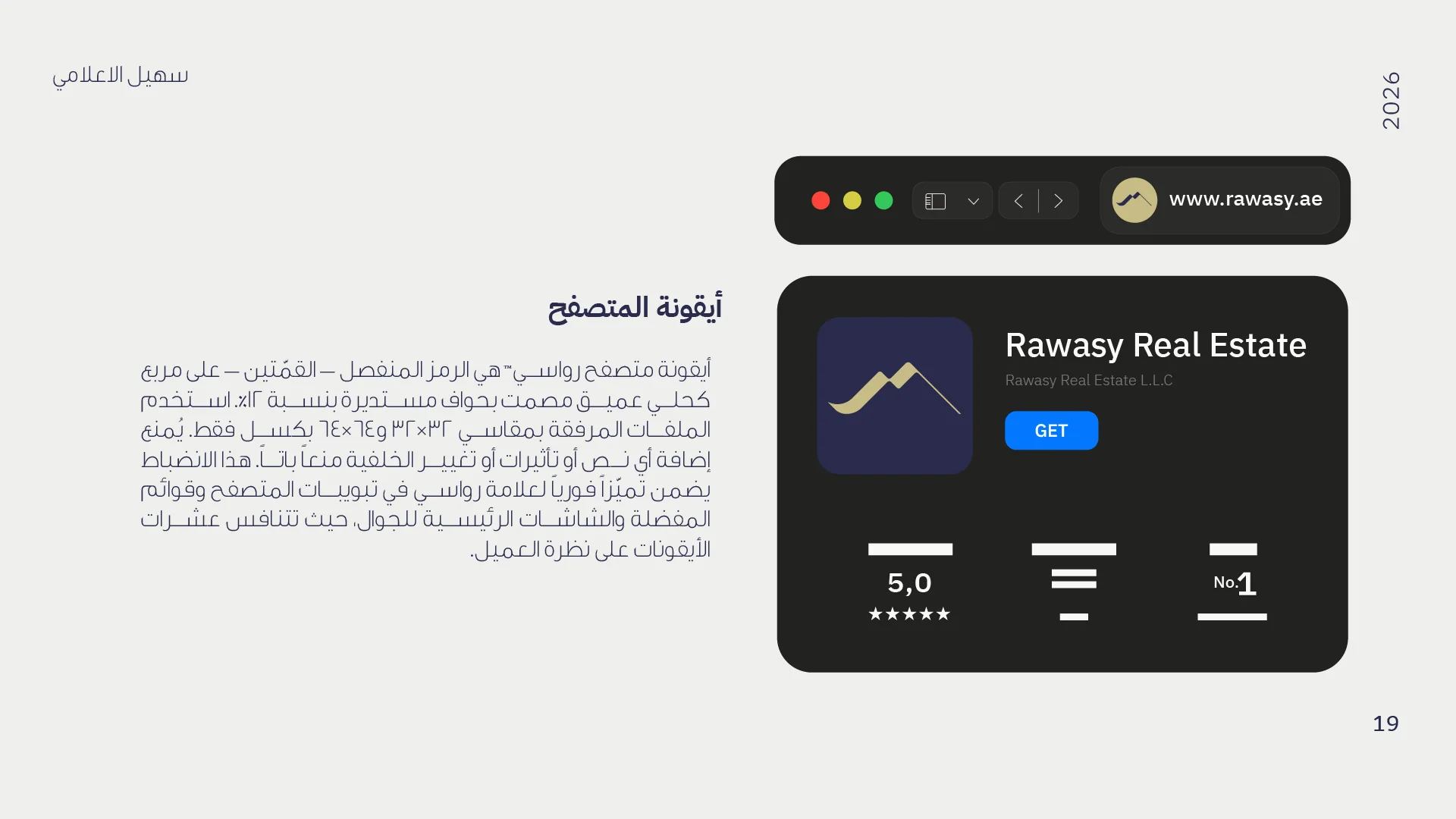
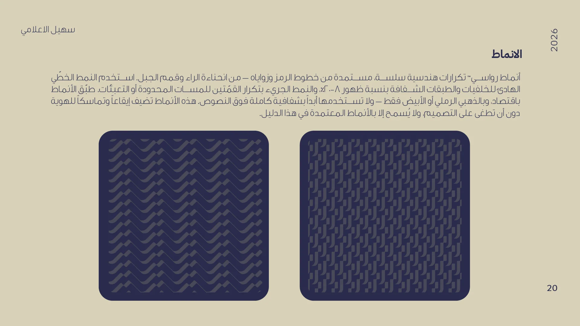
Every design decision serves one keyword — Al-Rasoukh (anchoredness). The mark fuses the letter "R" — the first letter of Rawasy — with twin mountain peaks: stability, adjacent rooftops (property and housing, the heart of the business), and an ascending line of growth. Deep corporate navy — the most scientifically proven color for building trust — meets muted sand gold: Emirati roots without shine or ostentation, quiet luxury for an audience that values refinement over display.
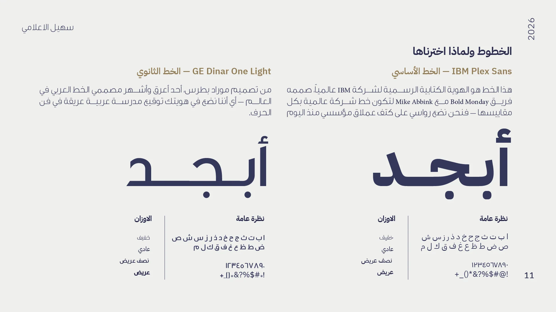
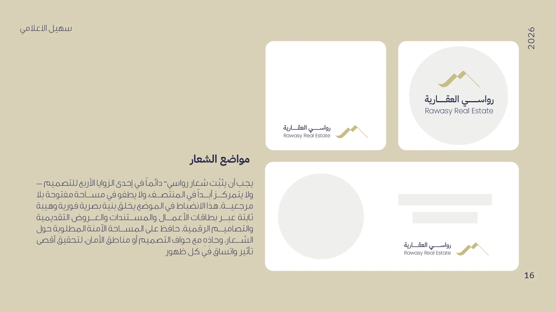
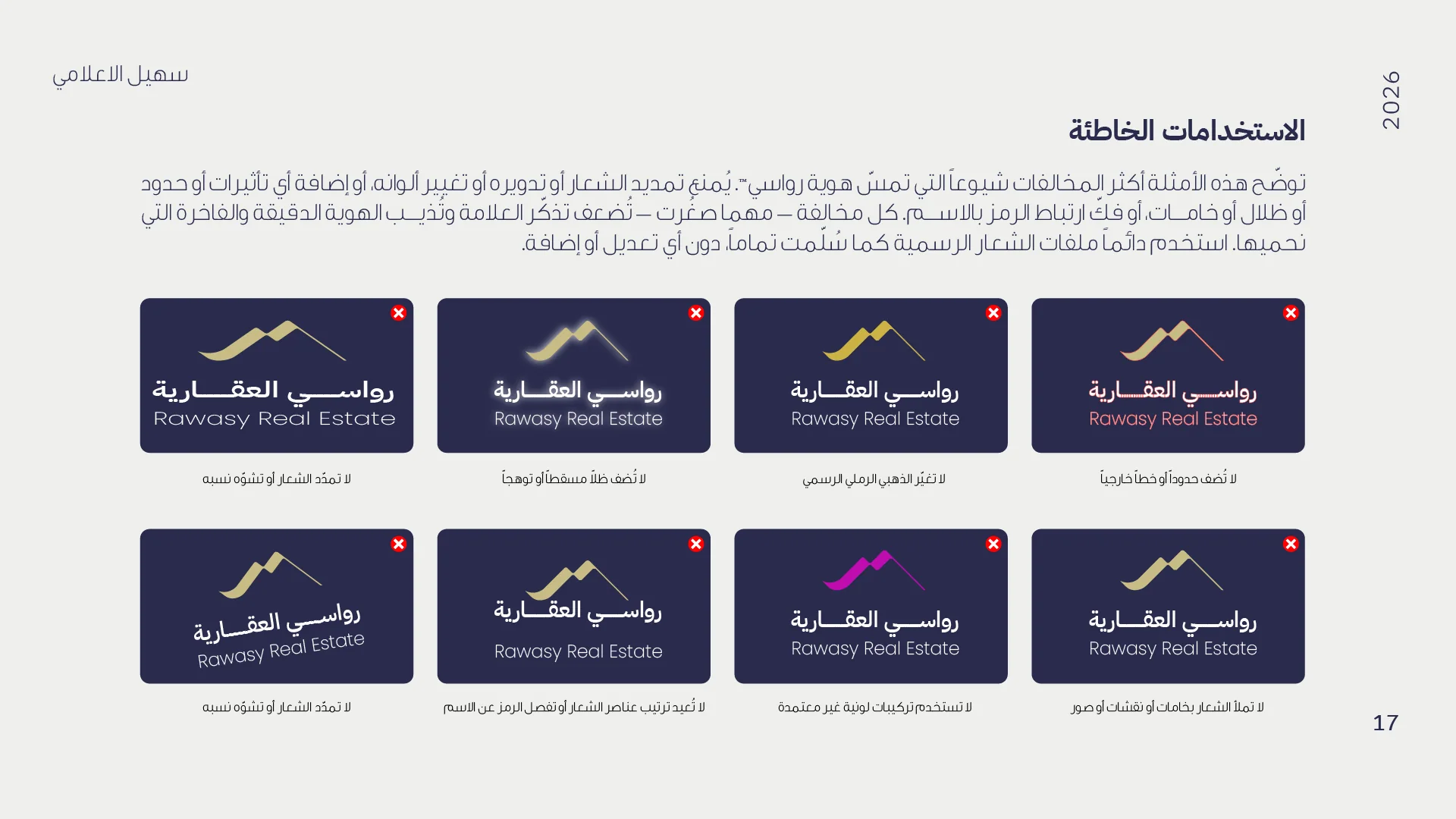
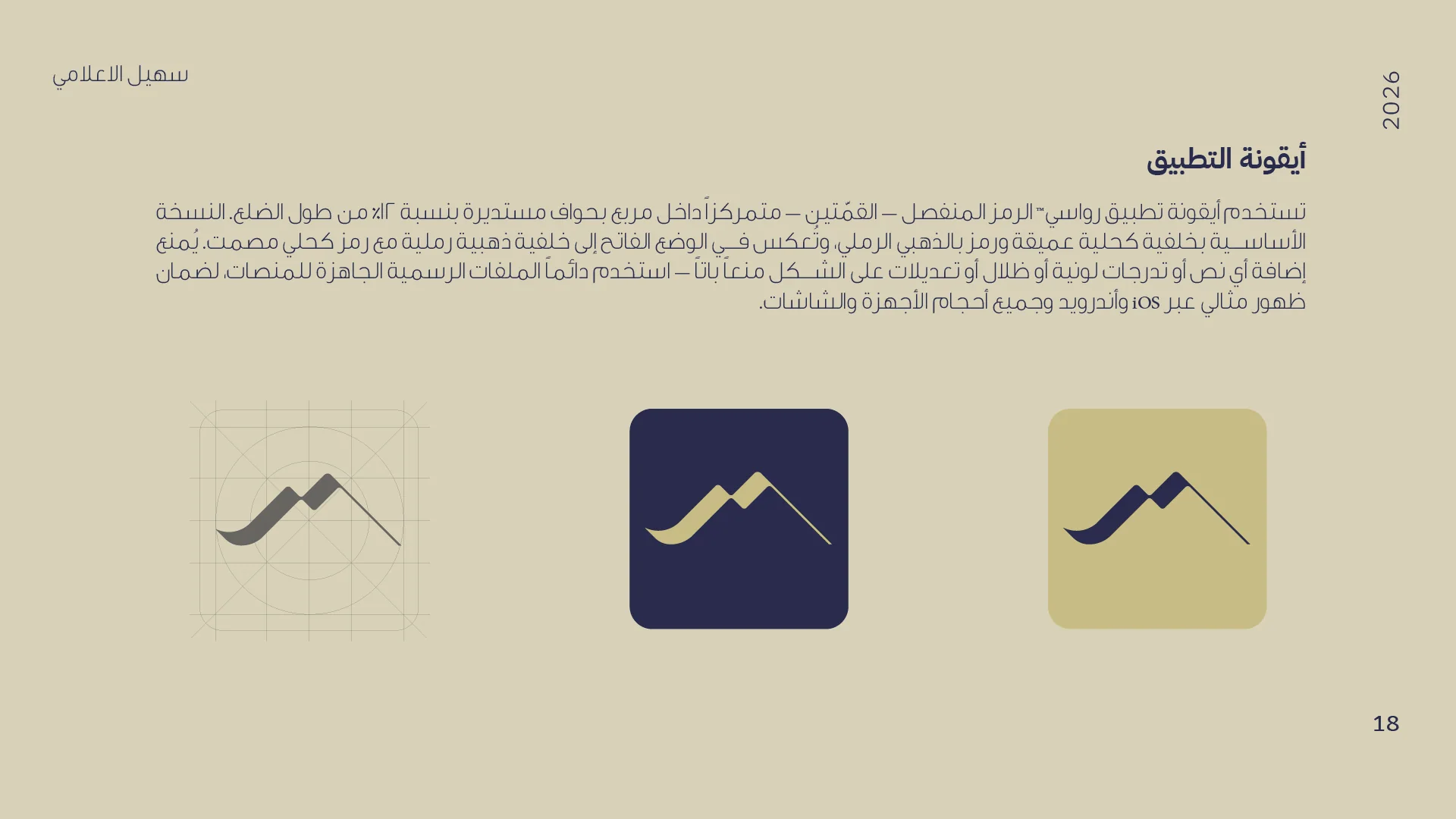
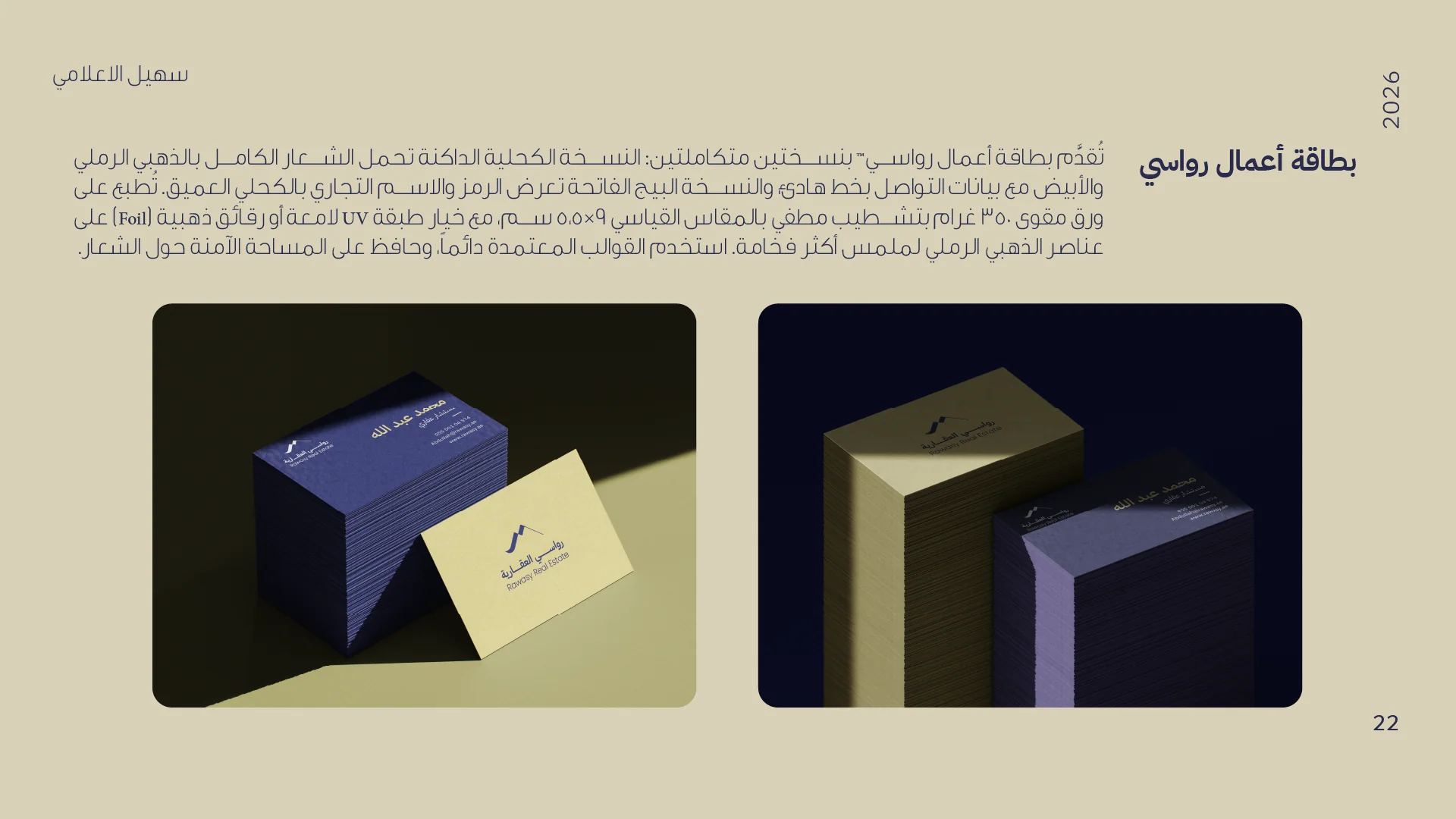
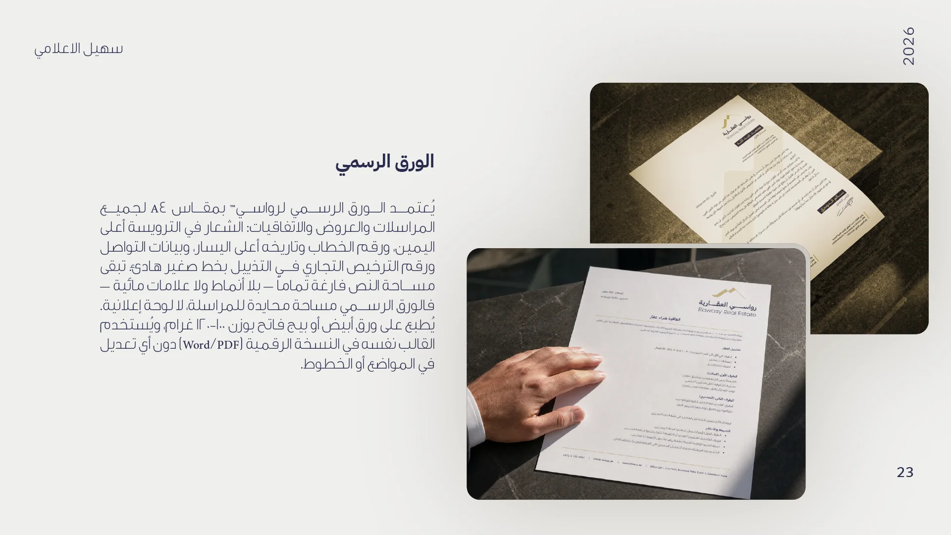
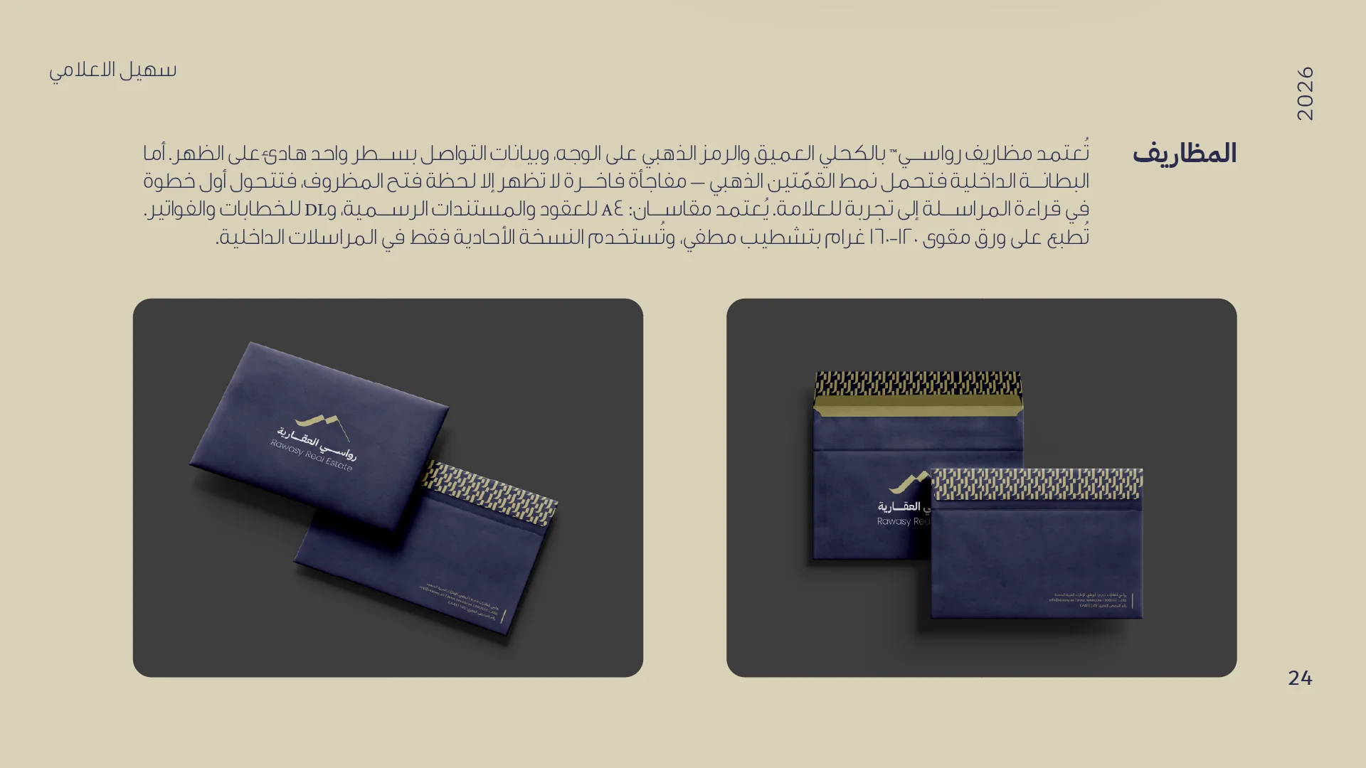
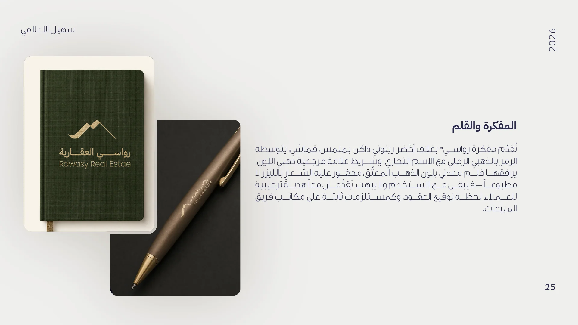
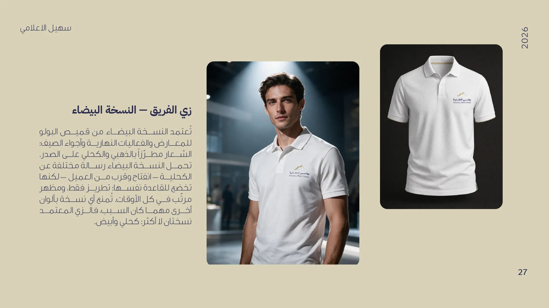
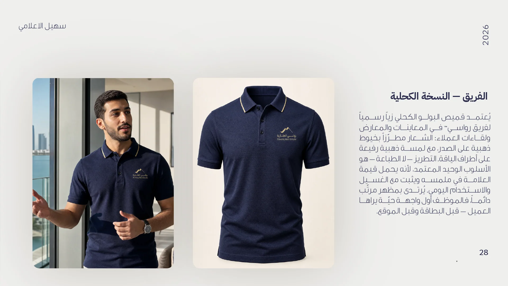
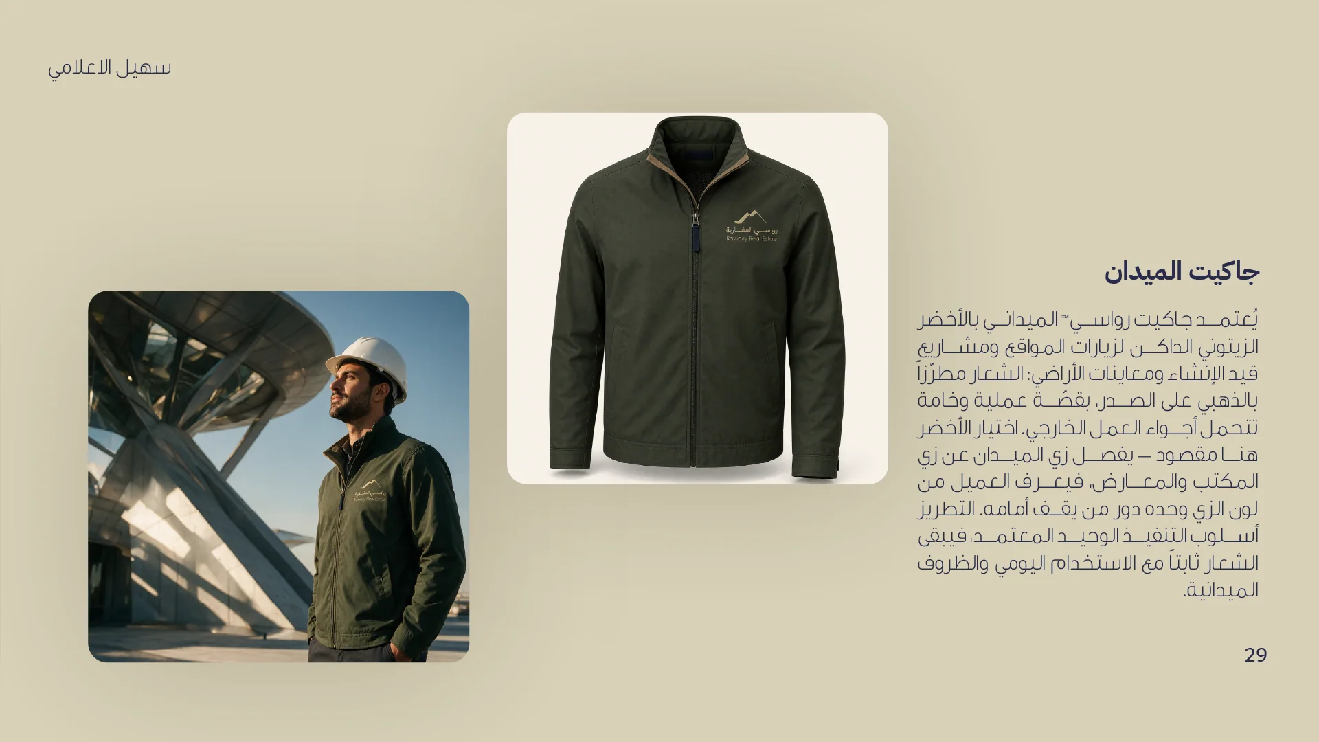
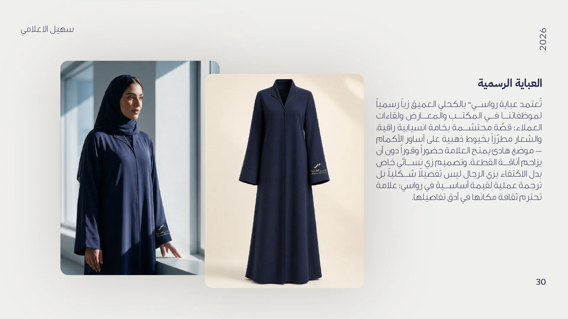
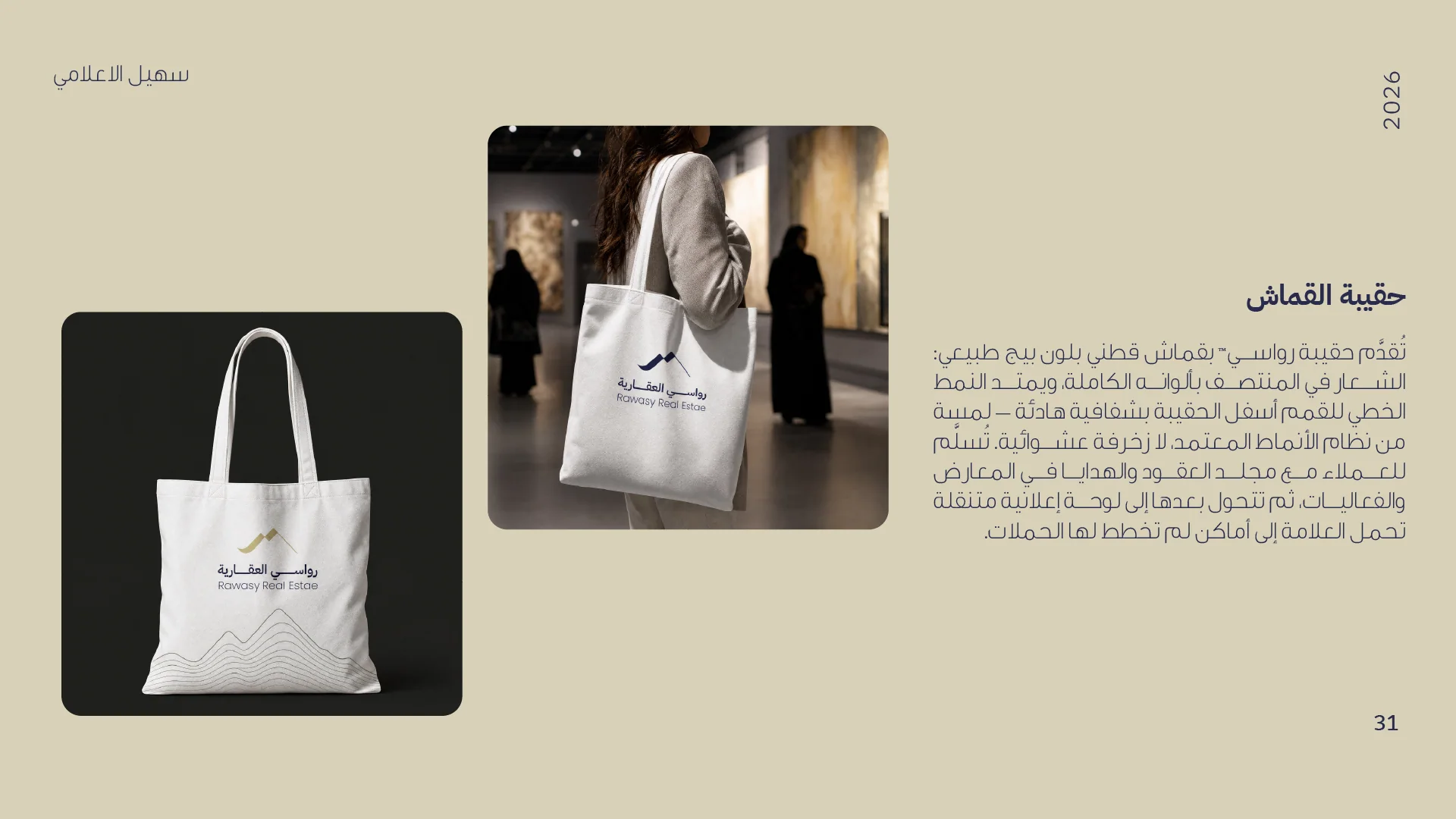
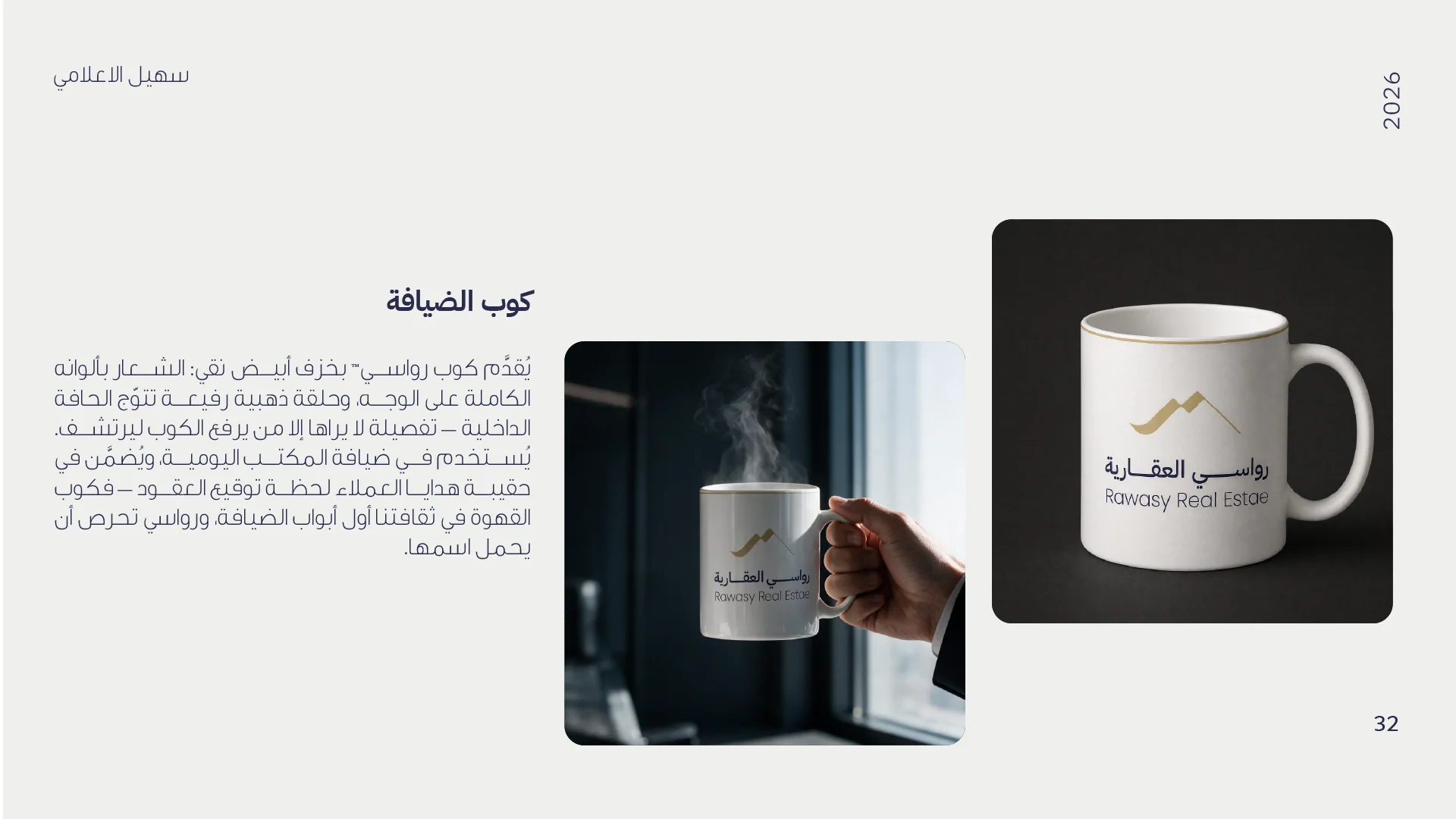
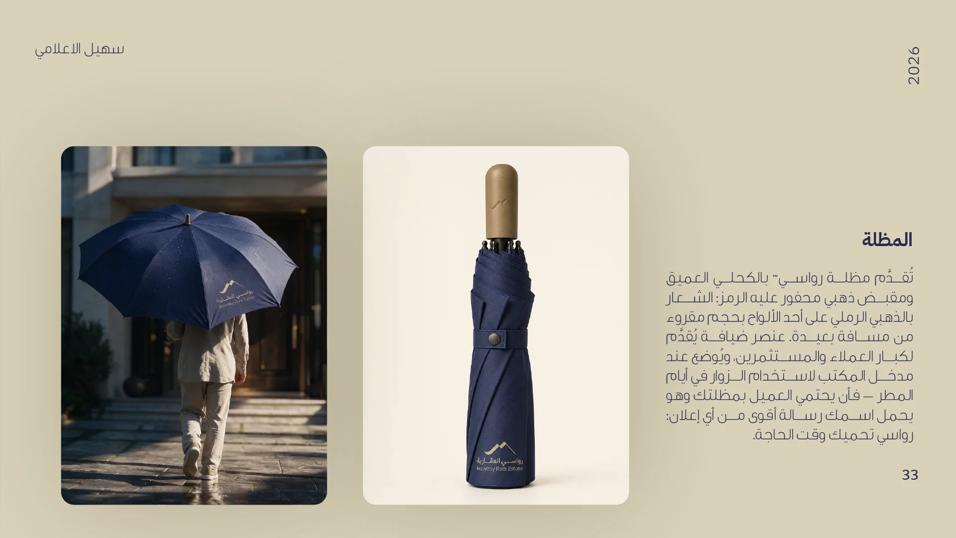
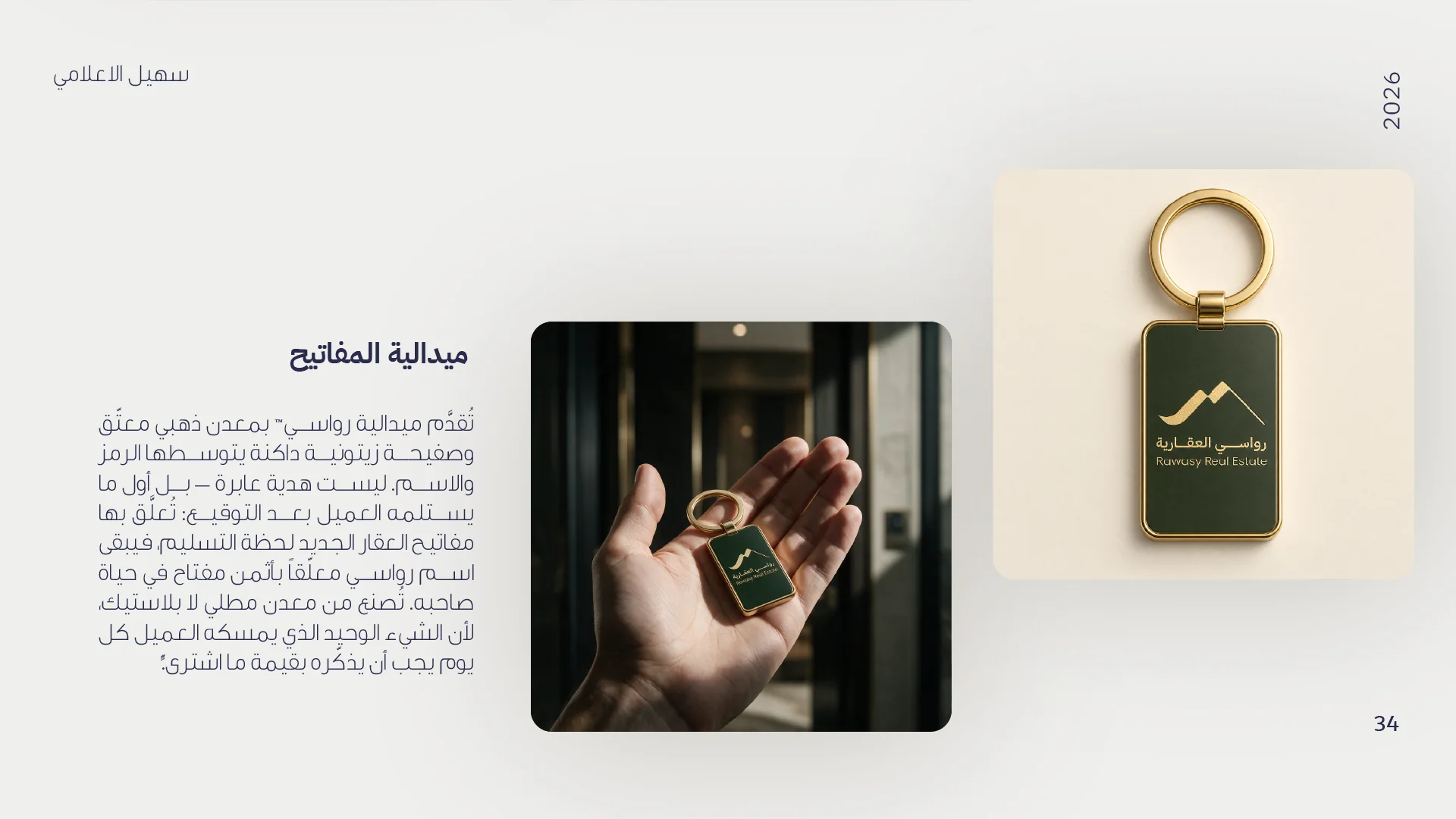
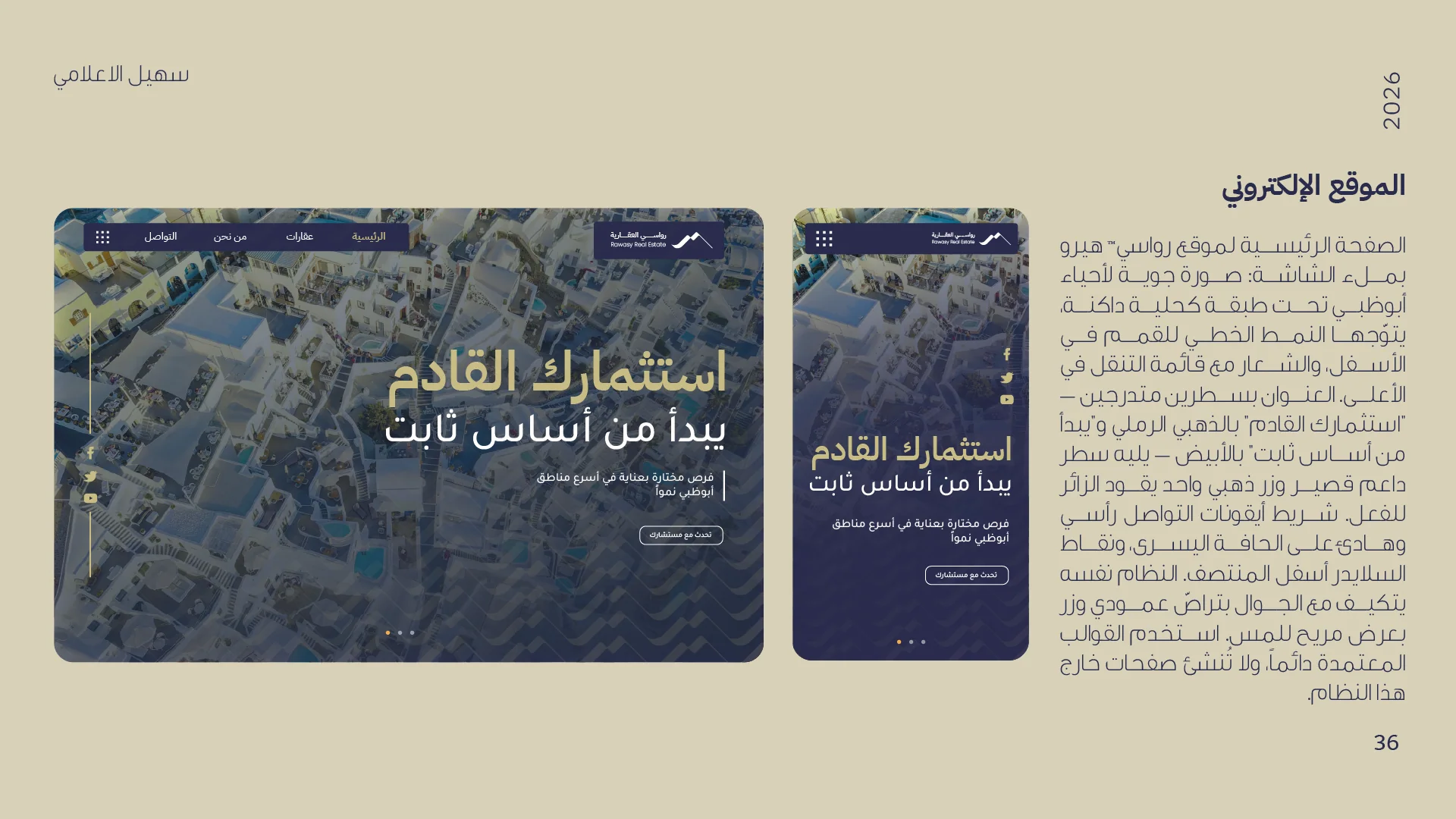
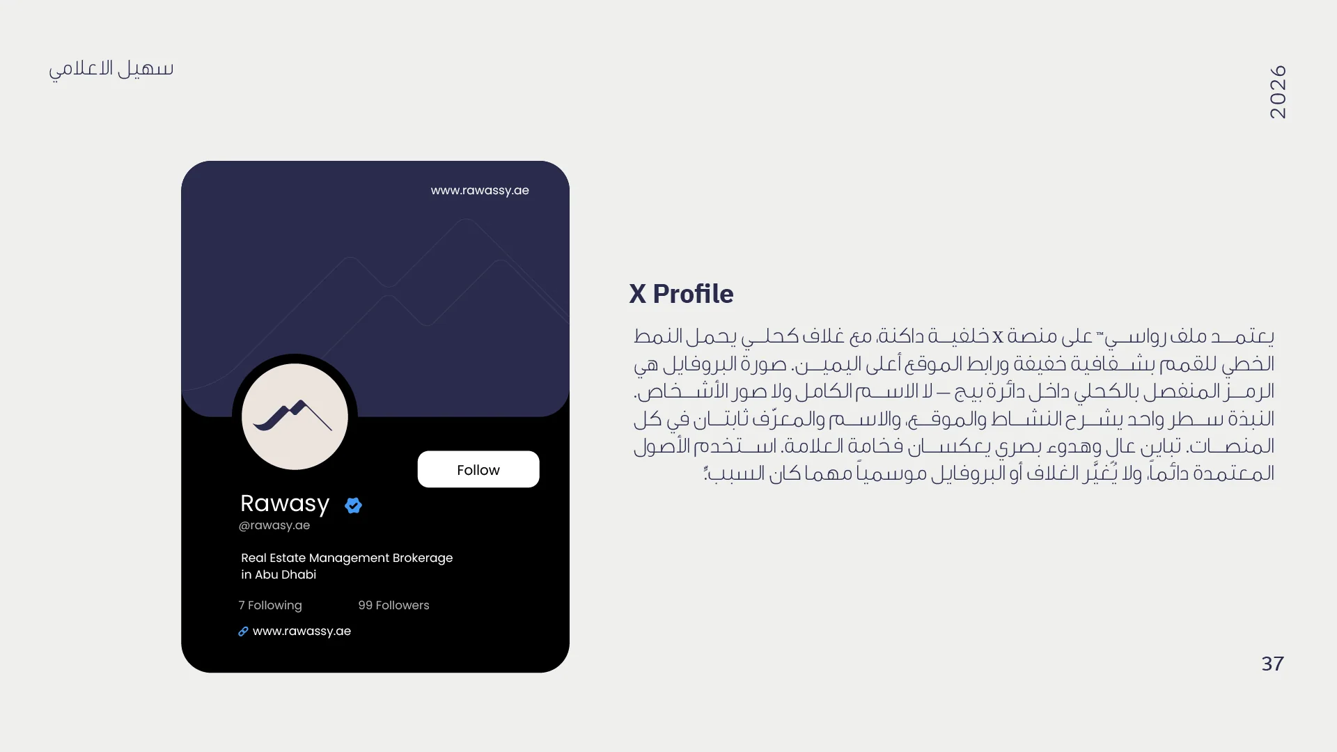
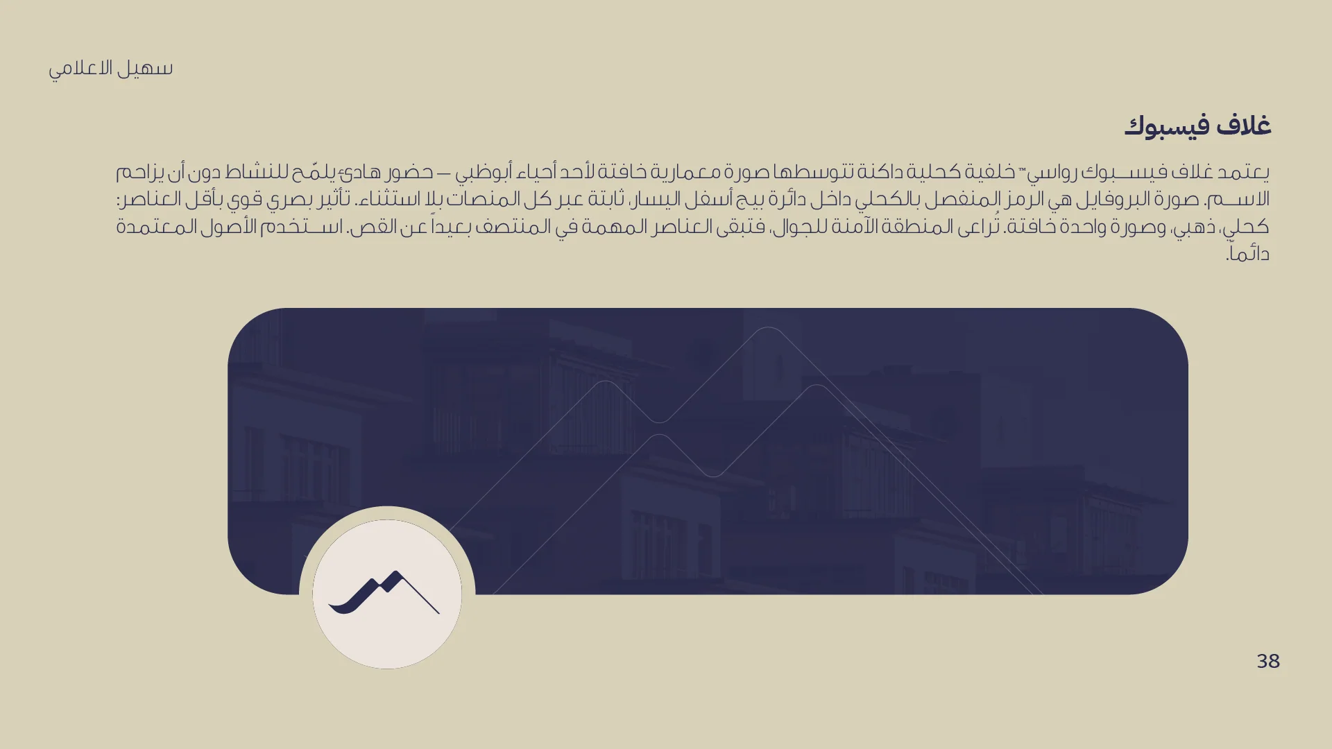
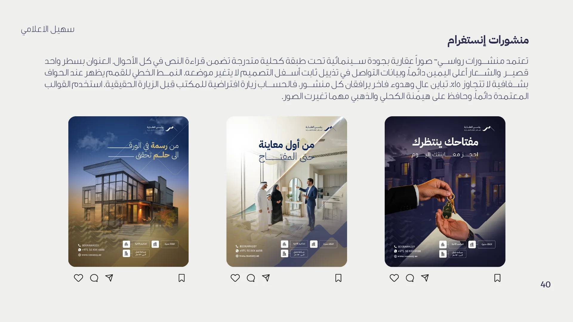
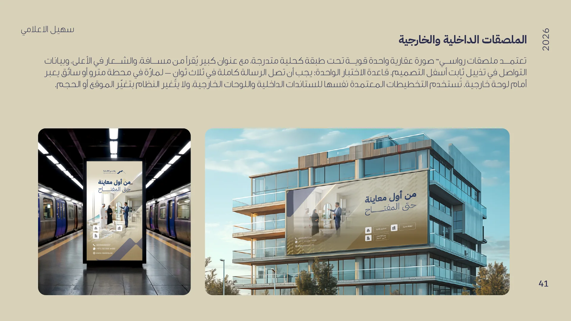
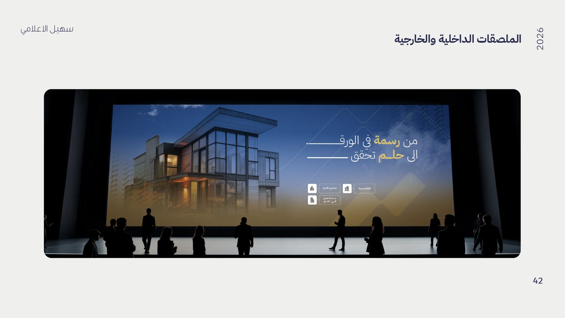
The full Arabic guideline covers logo analysis, color system, IBM Plex Sans Arabic typography, official stationery, team apparel, gifts, digital applications, and social media templates — a complete 43-page brand book delivered in both directions of use.